Doing the (Coronavirus) Math: Exponentials, Bell Curves and Flattening
A simple lesson in the math behind coronavirus COVID-19 predictions increases the appreciation for self-isolation and social distancing.
March 25, 2020

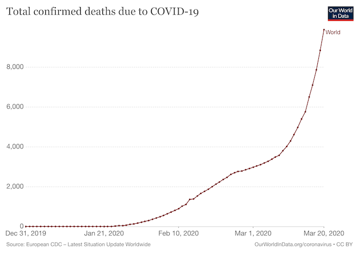
At first, the spread of coronavirus COVID-19 trickled in slowly. But that trickle turned into an exponentially increasing torrent very quickly.
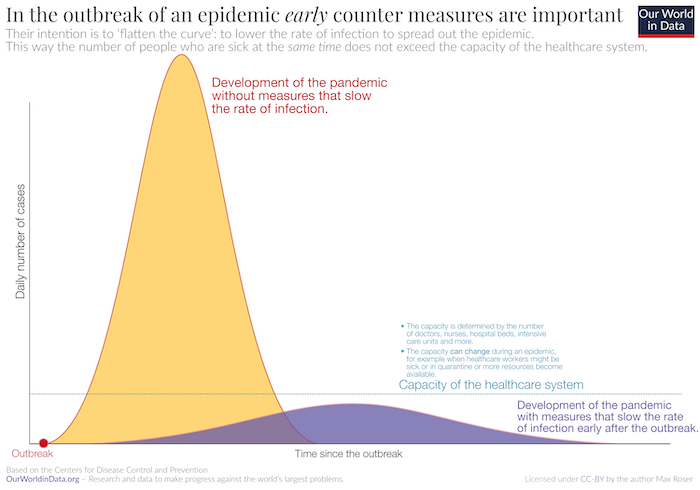
From past epidemics and pandemics, we know that at some point the rise of infected people will begin to taper off – thanks to an increase in the number of recovered people and anything that limits the spread of the disease. The resulting infectious curve takes on a bell shaped (normalized Gaussian) curve. The steepness of the bell curve is determined by how quickly a population becomes infected. If that rate can be spread out over time, then the curve becomes flattened out. This is a desirable outcome as it gives the resource constrained health officials, hospitals and the like more time to deal with the sick.
There are only a few ways to slow down the spread of a virus to flatten its bell-shaped curve:
Quarantine and Isolation – Quarantines restrict the movement of well people who may have been exposed to a disease to see if they get sick. Isolation is used to separate ill people from those who are healthy. The goal of both approaches is to prevent people from coming in contact with one another. That is why large crowds have been banned during the spread of COVID-19. Social distancing also helps.
Vaccines or Antidotes – Vaccines are used to reduce the chance of contracting the disease. Antidotes provide a way to treat people who already have the disease.
Predictive Models – Predictive models help health professionals and government agencies decide when and where to apply resources to stop or lessen the devastating economic and health effects of communicable diseases like COVID-19. But it’s important for the general population to appreciate the basic math that makes these predictions possible.
Exponentials: The Rising Curve
|
Image Source: Design News |
Population growth of viruses and many other natural phenomena are modeled using a logistic or S-shaped curve. Such curves represent an exponential function that is used in math to model growth. In simpler terms, exponential growth means that the number of cases of infected people doubles for a given time period. With the COVID-10 outbreak, that doubling occurs on average every two or three days. This doubling also pertains to the rate of the number of fatalities.
No virus can grow at an exponential rate forever. Virus growth is bounded by available resources, such as uninfected hosts, transmission mediaum, nutrients, water, etc. Still, the initial exponential growth of viruses do increase at an alarming rate.
For COVID-19, we know the number of infected people doubles every 2 to 3 days. To be conservative, let’s choose a 3-day doubling period. If there were 1000 confirmed COVID-19 cases today and the number was 500 cases three days ago, then the infection rate doubles every three days. As long as the deaths are doubling at a constant rate, the growth is exponential. This means that the original 500 cases will grow to more than 1 million cases after 11 doubling times or 3 days x 11 = 33 days (roughly one month).
Fortunately, this type of infectious growth rate doesn’t continue infinitum. As the growth rate peaks and begins to fall, the curve changes from an exponential one to a normal distribution or bell curve.
|
Image Source: OurWorldinData.org |
Bell Curve: The Rest Of The Story
|
Image Source: Design News |
For biological systems, the exponential growth curve gives way to the normal distribution or bell curve as the growth pattern begins to decrease. For COVID-19, the bell curve refers to the projected number of people that will contact the virus over a period of time – from the start to the finish.
The peak of the bell curve refers to the total number of people infected with the virus during the pandemic. The width of the bell is controlled by the standard deviation, which is a measure of the amount of variation for a data set. A low standard deviation indicates that the data points tend to be close to the mean – making the bell curve high and narrow. Conversely, a high standard deviation indicates that the data points are spread out over a wider range from the mean.
Mathematically, flattening the curve requires an increase in the standard deviation. Healthwise, a flatter curve leads to a lower rate of infection so the pandemic is spread out over time, thus giving health professionals a reasonable chance at treating all of the sick people with the available resources.
Without any measures to slow down the exponential growth, COVID-19 will continue to spread exponentially for many months. Eventually, enough people will recover from the disease to slow it’s spread. A person who has recovered from the infection will no longer spread it to a healthy person nor become sick again after coming in contact with the infection. However, if left untreated, the COVID-19 will spread throughout a population resulting in many deaths. As mentioned, such a scenario would quickly overwhelm the health care system with an exponentially increase number of infected individuals appearing in a very short time frame. This would lead to the death of many more people due to a lack of hospital beds, medicine, ventilators, and other resources.
For this reason, governments have been taking protective measures such as closing all but the most required services and commercial operations. Entire cities, states and nations have closed their boarders. Individuals and businesses are in self-quarantine and/or self-isolation to avoid crowds with the goal of slowing the spread of the virus by “flattening” the infection curve.
We know from history that this approach will work as well as by witnessing the recovery and limited number of deaths in China as compared to Italy. But such an approach is not without consequences as it is taking an almost depression-like toll on businesses around the world.
|
Image Source: Our World in Data / CC |
John Blyler is a Design News senior editor, covering the electronics and advanced manufacturing spaces. With a BS in Engineering Physics and an MS in Electrical Engineering, he has years of hardware-software-network systems experience as an editor and engineer within the advanced manufacturing, IoT and semiconductor industries. John has co-authored books related to system engineering and electronics for IEEE, Wiley, and Elsevier.
About the Author(s)
You May Also Like


