Sign up for the Design News Daily newsletter.
4 Tips for Designing the Most Effective Touchscreen Interface
If you’re thinking about implementing a touchscreen into your next product, you don't want to forget these guidelines.
January 26, 2016
4 Min Read
.svg?width=850&auto=webp&quality=95&format=jpg&disable=upscale "4 Tips for Designing the Most Effective Touchscreen Interface")
Touchscreens have become de facto input devices because they are intuitive and easy to use. More and more new products are incorporating touchscreens to further enhance the user experience. But to make a touchscreen implementation truly successful, important considerations need to be taken during the design of the user interface. If you’re thinking about implementing a touchscreen into your next product, the following guidelines will help improve overall performance.
1.) Know What to Expect
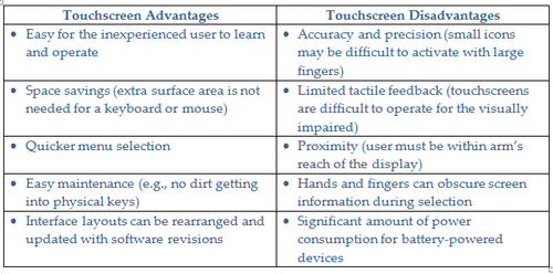
First, consider the following table of points before specifying a touchscreen into your product in order to make sure that touchscreen technology is the right fit for your application.
If any of the aforementioned limitations could cause significant problems for your users, consider countermeasures or alternative methods upfront in design development.
[Learn more design trends and the latest developments at Pacific Design & Manufacturing, Feb. 9-11, at the Anaheim Convention Center.]
2.) Optimize All Trigger Elements
Design all trigger or activation elements (buttons, arrows, checkboxes, sliders, etc) to optimize usability.
Size: For reliable activation size all trigger elements with large fingers in mind. Make sure that these elements are big enough to easily touch (but not so big that they get pressed accidently). To further reduce touch errors, the minimum height and width of each activation area should be equal to the measurement of the average fingertip size, which is 8 to 10 mm (0.3 to 0.4 in.).
Spacing: Space elements far enough apart to avoid them accidentally being pressed. There should be at least 1 to 2 mm (0.04 to 0.08 in.) of space between each element.
Make critical elements larger: Errors tend to increase as touch areas get smaller, so don't use undersized buttons for important trigger elements. Whenever possible, enlarge these buttons and try to make them much bigger than other nearby elements. In general, when designing trigger elements, “bigger is better” for both sizing and spacing.
3.) Optimize Layouts
Layouts of information and elements should minimize distraction.
Keep it simple: Keep messaging clear, concise, and simple, and only elaborate when absolutely necessary. Also, before adding any new items, ask the question, “Does the user really need to see this?” Think like a minimalist and only show those items that are needed for each task.
Be intuitive and consistent: Your users are probably well acquainted with many other interfaces that they frequently use. Help users feel more comfortable by creating layouts that are similar to the interfaces with which they are already familiar. Be consistent and use the exact same language, layout, and labeling terms throughout all menu options.
Remember that hands get in the way: Hands can cover important information when pressing trigger elements. Best practice is to position the labeling information on or above these elements (and not underneath them) so that information doesn’t get covered by the hands. Also, since most users are right-handed, consider placing information on the left side (so users can still read it while touching the buttons).
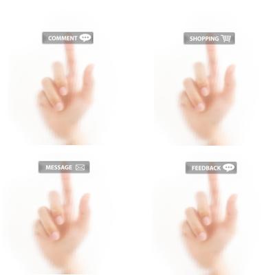
Positioning text on or above touchscreen buttons helps prevent information from being covered up by the hand when pressed. (Source: Digitalart at FreeDigitalPhotos.net)
READ MORE ARTICLES ON INTERFACE DESIGN:
4.) Consider Additional Features
Additional features can be added to improve the overall touchscreen experience.
Provide feedback: Provide immediate feedback using auditory and visual cues or simple messaging to show when a user’s actions are right or wrong. If the user causes an error, use messaging as a teachable lesson to clearly explain the problem (and to help prevent it from happening again).
Choose the best activation method: “Up triggering” (activation upon release) is preferred over “down triggering” (activation upon press) to reduce errors. Best practice is to highlight the element when first touched and then trigger the element when the finger is released.
Conclusion
In summary, a well thought out touchscreen interface will allow users to easily perform their intended tasks and reduce confusion. Incorporating basic touchscreen usability features into the interface design will greatly improve user engagement and satisfaction.
Greg Jung has more than 25 years of experience designing medical equipment and electro-mechanical products for a wide variety of industries. He also served in various project management roles and has led global, cross-functional development teams for a wide variety of programs. During this time, he developed several award-winning and patented product designs. Greg holds bachelor and master of science degrees in mechanical engineering from the Georgia Institute of Technology.
Like reading Design News? Then have our content delivered to your inbox every day by registering with DesignNews.com and signing up for Design News Daily plus our other e-newsletters. Register here!
(Main image source: nuttakit at FreeDigitalPhotos.net)
You May Also Like
Editors' Choice


Jun 4 - Jun 6, 2024
Jun 4 - Jun 6, 2024
Innovation in automation starts here. Discover and collaborate on automation solutions that are revolutionizing the entire production lifecycle — from design to production to market — and sharpen your competitive edge. ATX South is part of IME South, a six-in-one expo offering the latest insights & solutions spanning medtech, packaging, automation, plastics, design, & processing.
Register Now