Engineering the Future With 3D Software
December 9, 2013

Take a trip to any industrial technology exhibition, and brace for more sensors than anyone can imagine. From the standard old thermocouples in new sizes and packages to complete low-power wireless cloud based systems, cheap technology has everyone collecting data. The outcome is tremendous amounts of data being collected at any one moment.
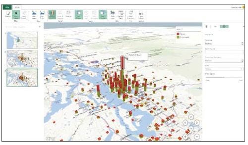
Presenting this data in a stomachable way is the challenge. Take Microsoft's "GeoFlow," an unfinished project aimed at giving Excel new ways to visualize data. It takes map-based data and lets a user build 3D representations alongside the 2D graphs. From there, users can build upon the 3D data featuring other elements, such as time. For example, population growth over time. Watching hundreds of cities grow in accelerated time is something no 2D graphs can show in such a succinct way.

In a very similar manner, many software companies are now making changes or creating whole new programs to handle the large amounts of data being produced. In general, these large data sets are what are becoming known as "big data." In fact, big data is now becoming so prevalent, President Obama set aside $200 million in funding earlier this year specifically for big data research and development. These funds are set to be divided among the National Institutes of Health, the Defense and Energy departments, and the US Geological Survey. As a result, some challenges now associated with analyzing, visualizing, storing, and searching big data are being overcome.
One example of showing large amounts of data differently is Steven Uray's 3D bitcoin price graphs. Bitcoins can be thought of as a all-digital type of currency. Bitcoins can be bought and sold very similar to the way stocks work. The value of a bitcoin varies against the value of modern currency such as the US dollar and the Euro. Additionally, bitcoins are increasingly being used as a type of payment for products and services. Just as owners of stocks look over and check on their investments, owners of bitcoins repeatedly check on the value of their bitcoins.
The 3D price graphs Uray has created uses current data being logged from the bitcoin market and displays it in a 3D format, allowing a deeper and more in-depth look at current trends. Typically, bitcoin graphs consist of two axis, time on the X-axis, and volume/price both displayed on the Y-axis. The difference in using a 3D graph is that blocks can be used to represent data in a clearer way. Each block has a width, depth, and height, which are used to describe three important variables in the bitcoin market.
Furthermore, colors were used to add more information into the graphs. Red cubes represent a time period with average prices lower than the previous time period. Likewise, green cubes represent a period of time with prices higher than the time prior to logging that data. As a result, viewers can easily see trends more readily than they would have if they were looking at a traditional 2D graph.
About the Author(s)
You May Also Like


